
GoldPriceOneMobile 1.3.2 - Widget improvements
Posted in: News about GoldPriceOne
Our latest update is focused on optical improvements, such as better readability, for example. This is why we did a complete redesign of the home screen widget.
The results are astonishing, as the widget still looks the same in regular light and dark mode, but it has a much better appearance (in terms of readability) when in glass or tinted mode now.
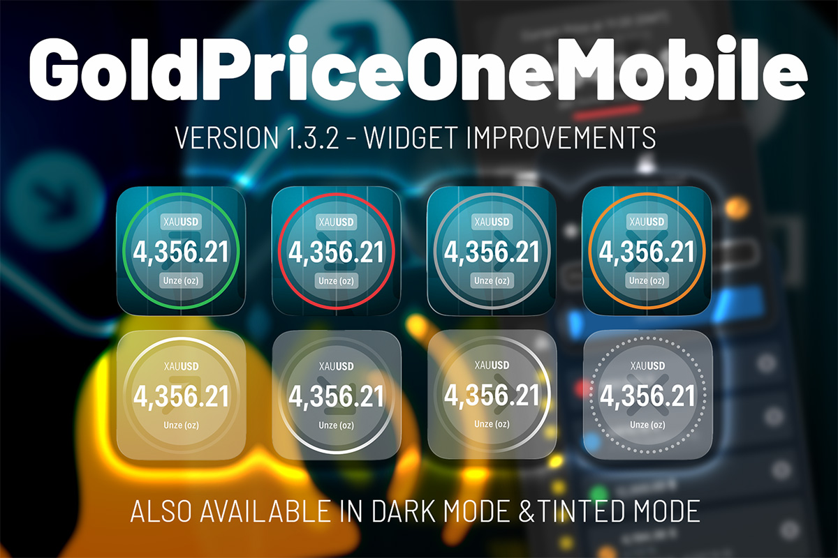
In standard light and dark mode the trend indicator uses green (up), red (down), gray (no change) and orange (unknown/network or connection problem). Always shown as a ring around the trend indicator arrow icon.
Well, in glass or tinted mode the operating system, i.e. iOS 18 or iOS 26, shifts all colors to black and/or white. This looks pretty cool, but also reduces our trend indication to the arrow icon. Now with update 1.3.2 when in glass or tinted mode the widget uses a gradient to show the gold price trend. Gradient from top (100 % white) to bottom (10 % opacity) signals an up trend, same gradient from bottom (100 %) to top (10 %) shows a down trend, form left (10 % opacity) to right (100 % white) indicates that nothing happend since the last price update. The direction of the gradient follows the trend arrow icon - at least it kind of follows.
Additionally, there is a dotted ring that replaces the orange indicator of the standard light and dark mode, when status is unknown.
#ios widget #goldpriceone #glass mode #tinted mode #update #goldpriceonemobile
20260821 marketing